Site Update!
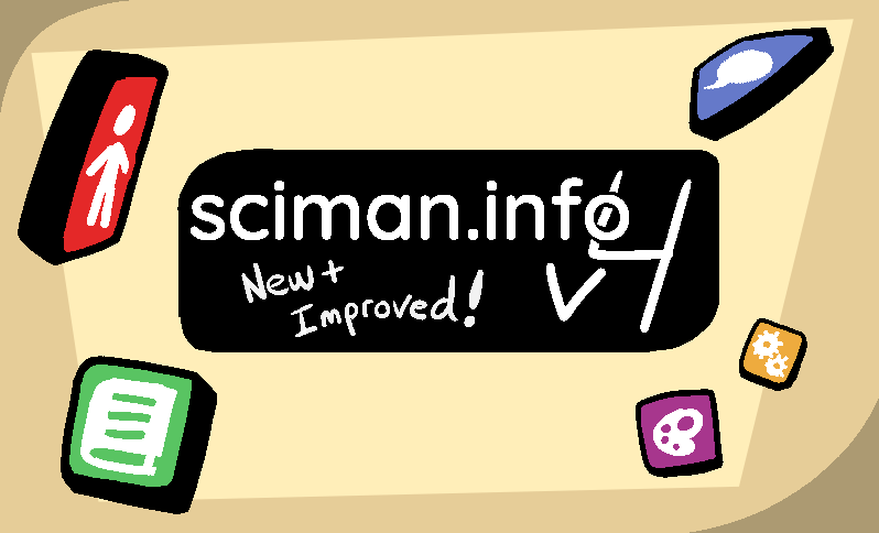
sciman.info has been through a few complete overhauls throughout it's life. Recently, I felt inspired to go at it again, and the result is what you're looking at now- version 4 of sciman.info.
(It's worth noting this will probably break the RSS feed- if you're subscribed to me, first of all, thank you! But you'll probably want to re-add my feed just to be safe).
Anyways- I figured it'd be fun to explain some of the choices I made in designing this site. I'm happy that every time I remake this place, it feels like an improvement and not just meaningless reshuffling, so I figure this kind of thing might be useful to someone out there. If it isn't, I hope it's at least kinda interesting.
Minimalism
For better or worse, I'm a sucker for minimalism. I don't think everything should be flat grey shapes, and I understand the pushback against the modern, flat corporate style. But, it's a lot easier to make considered design choices when you're dealing with fewer moving parts. I really admire people who can pull off maximalism, but for now that's not my style.
Besides- I think of sciman.info as a hub, more than anything. It's where I can share my other works, but the site itself isn't meant to be too flasy. I want it to be nice, sure, but really this is more a document than an application. So- simple fonts, clear buttons, and contrasting colors for different regions. If I want to show off something more over the top, I can have that be a single page, not the whole UX.
Filesize
Something else I tend to focus on is keeping file size down for the site. Again- this is a hub for my work, I don't see the reason to make a user download 3 JavaScript libraries and 20 megabytes of images to load a home screen. All the icons are SVGs from the Noun Project, and all the fonts use system font families, so nothing actually needs to be downloaded for that. That's also why there aren't many images on the site, outside of pages like art or projects- and for those images, I try and quantize them to reduce filesize. It keeps the site fast, and it just feels polite to not burden people's machines or network with extra resources.
No JavaScript
On that note- this site avoids using JS wherever it can, and has for pretty much all of it's existence. JavaScript is a powerful tool, and I'm not wholly opposed to it where necessary. But, like I've been saying- this isn't an app. I don't need jQuery or React to display a few pages of text and some links.
That said- I use plenty of JS on my end, before the page is rendered. This site is generated through a static site generator called Phantomake, which can leverage EJS templating to reduce the amount of repeated HTML. There's tons of stuff written to process the site, I just don't want that to be on the end user's machine.
There's a few specific pages that use JS. The art page, for instance, uses the gallery-grid script made by espimyte, a really powerful and easy to use script that makes displaying art way more practical. It's a really well made tool, and I reccomend it if you're looking for something similar. I modified it slightly for my needs, but doing so isn't hard at all.
I don't think people should avoid JS entierly, by any means. I just feel that, for my use case, it's mostly unecessary fluff. My time on cohost also showed me just how much you can achieve with CSS alone, and whenever I get around to adding a dark mode, I plan on making it function that way.
There's one very notable exception to this rule, though-
Splash Messages
Under the 'sciman.info' header, every version of this site has had some kind of splash message. I was mostly inspired by the yellow text on the Minecraft main menu. The script to randomize the message is tiny, and if the user has JS disabled, it defaults to a static subtitle.
It's nothing huge, but I really love this feature. I feel like it adds a lot of playfulness to the site, and gives me a chance to cram in a bunch of jokes that don't really work elsewhere. Aside from Minecraft, I also know Terraria randomizes it's title bar, and YellowAfterlife's site has it's own splash message subtitle.
I really reccomend finding some way to cram this kind of thing into your own site, it's really fun.
Palette & Visuals
The site's pallete remains basically unchanged from version 3.
The specific color for the background has a bit of backstory to it - when I first got into digital art, I drew on a white background. I eventually learned using a grey background is easier on your eyes, so I switched to that, and then decided to go for an off-white tan kind of color so it didn't look as sterile. When I made v3 of this site, I used that color for the background. I think it was a good choice - the warm tones are easy on the eyes, while retaining the benefits of a light mode for readability. I also don't feel like a lot of websites go for this look, so it stands out a little.
The badges ![]() are new, though- the little raised boxes used for the social links and post categories. I knew I wanted to add a main page with everything recent listed, but I needed a quick way to differentiate post types, and ended up with the badges. They have a kind of Nintendo DS-esque charm to them, which was an accident but one I'm very happy with.
are new, though- the little raised boxes used for the social links and post categories. I knew I wanted to add a main page with everything recent listed, but I needed a quick way to differentiate post types, and ended up with the badges. They have a kind of Nintendo DS-esque charm to them, which was an accident but one I'm very happy with.
Layout
Every iteration of the site before now used a top header for navigation. This was fine, strictly speaking, but it started to feel like a waste of space. I've come to appreciate that having text span the whole width of a monitor actually sucks, and constraining the main content of a page to a narrow column is better. But if the top of that column is taken up by a header, less room for content. Since there's so much room on the sides of the column, might as well move the navigation to a sidebar.
The sidebar is honestly what motivated this entire rewrite, and I think it worked out really well. It feels clean, easy to read, and lets me put way more info into navigation than the older versions of the site.
Characters
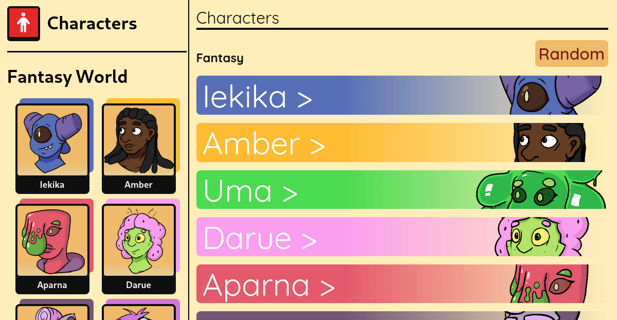
I still want to tweak the actual wording on a lot of the pages, but that'll be for later. For now, I've filled out the roster and left some pages as a WIP for their actual story. I've got a lot more plans for this section down the line.
Projects
I brought back the projects section from v2. I figured it'd be good to have a place to showcase some of my more substantial projects. This site, for better or worse, is something I tend to link to employers and the like, so it seemed like a good call. It's also just nice to have a record of accomplishments, for my own sake.
And, that's about it! There's other small details, but that's the biggest stuff. I've got a lot of plans for stuff I wanna add, this was a good reminder that webdev is fun for me. I hope you like the new look- and if there's any issues, bugs or general improvements, feel free to drop me a line at hello@sciman.info.